
Our aim for today's workshop was to create an album cover. We had to visit Wikipedia to get a random Wikipedia article. The title of this article was to be the name of our band. We then had to visit a quotations page to get a page of randomized quotations. The last four or five words of the very last quote of the page would be the title of the album. We then had to visit Flickr to get some randomised photos that have been uploaded to flickr in the last week. The third picture was to be used for album cover.
Our actions for Photoshop:
- Create a new Photoshop document that is 800 x 800 pixels in size and a resolution of 72dpi.
- Using layers, and the Type Tool put each of your elements on a new layer in this document so you can manipulate them separately.
- Design! Some things you might want to think about: layer opacity, selections, typography, colour saturation and levels.
ALBUM COVER 1:
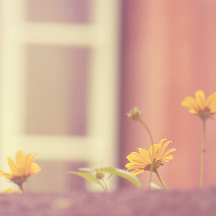
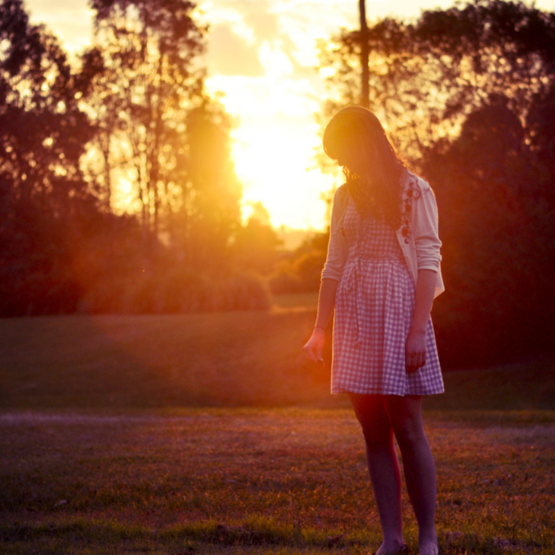
Original photo:
Inspiration:

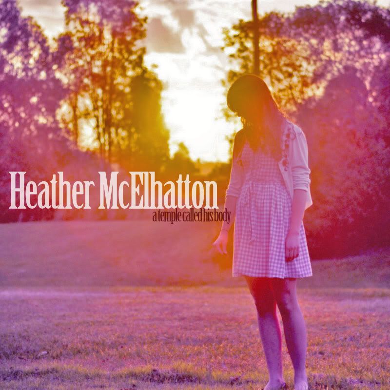
Final image:
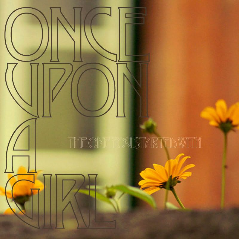
For this album cover, I went with an 'indie' theme. I altered the colours using the RGB settings and turned the image a more yellow-y colour. I wanted to keep the image fairly dark. The name of the band is 'Once Upon a Girl' and the name of the album is 'The One You Started With'. I really like the alignment of the text in this image. I think it works well with the 'indie' theme.
ALBUM COVER 2:
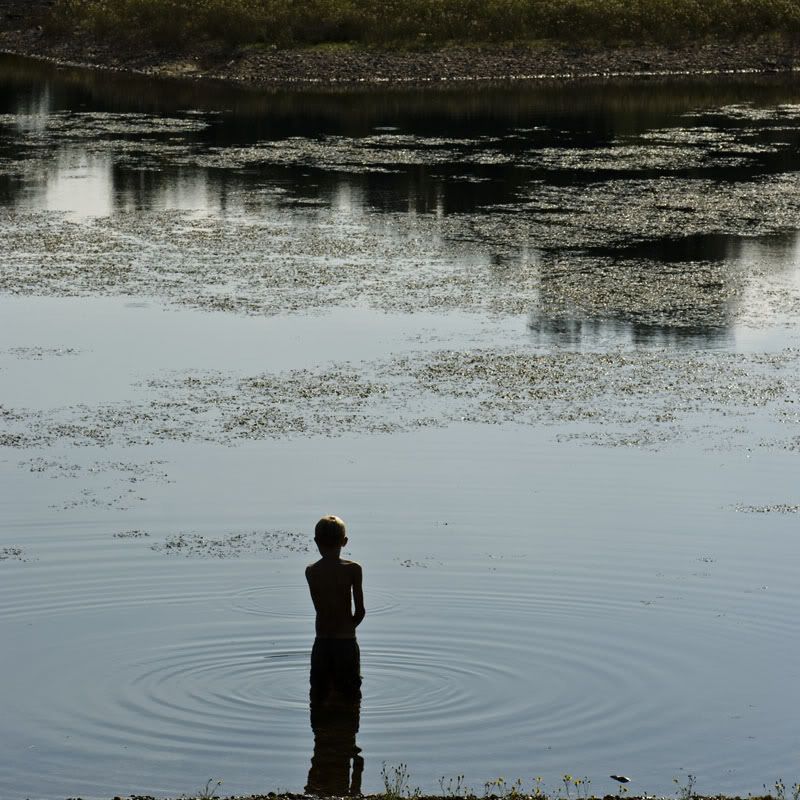
Original photo:
Inspiration:

Final image:
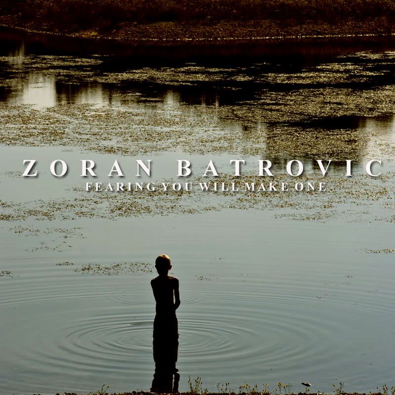
For this image, I imagined it to be for a classical album, taking inspiration from Hilary Hahn, Rolf Lislevand and Christian Wallumrod. I kept the font fairly simple, but added a 'drop shadow' effect to it. I originally wanted to turn the image greyscale but quite liked the little bit of colour in there. I think greyscale might have made it look a bit too boring.
ALBUM COVER 3:
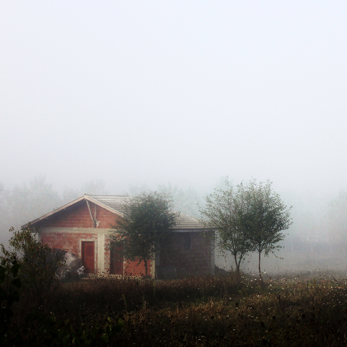
Original picture:
Inspiration:

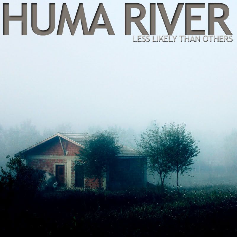
Final image:
I think this image is my favourite. I really like the effect used, I think it gives it a really modern yet vintage kind of feel - kind of like a lomography camera effect or the popular iPhone app 'Instagram'. Again, I kept the font fairly simple, because the effect on the image is quite complex and I didn't want to make it look like too much on one space. I think this album might be a good pop/folk album, so I took inspiration from artists such as KT Tunstall and Nerina Pallot.
ALBUM COVER 4:
Original picture:
Inspiration:

Final image:
Finally, this image is more of a rock/alternative genre. I changed the hue of the image into a blue colour, giving the image a cold and derelict look. Then the font was placed boldly across the top in capital letters and again in a dark and 'muddy' looking colour. I feel that although this is quite simple, it has a great look for this particular genre. The inspiration I took was from bands also of a similar genre and they all kept the cold and abandoned/derelict look when it came to using buildings and architecture in their album artwork.